Gaming platform · Design system
Building the foundation.
Nifty Island.
Creating a flexible design language from scratch for a growing gaming platform, and the people building it.
- My role
- Founding UI/UX Designer · Sole designer
- Scope
- Brand foundations, components, product flows, and design direction
- Collaborators
- Frontend, backend, game, art, marketing, and blockchain teams
- Surfaces
- Web platform and in-game UI
01The problem
A growing platform needed a shared foundation.
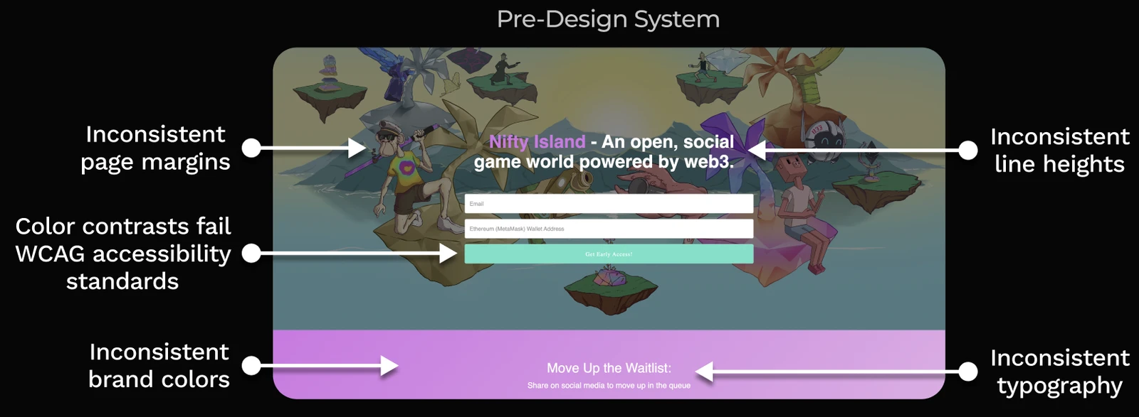
When I joined Nifty Island during its pre-launch and early beta phase, the product lacked a unified design foundation. Engineers were rebuilding UI and making visual decisions independently, creating inconsistent interfaces and accumulating design debt.
Spacing, typography, line heights, and brand colors varied between screens. Contrast issues made parts of the interface harder to read. With a marketplace, rewards systems, and creator tools on the roadmap, these one-off decisions were becoming harder to maintain.
The team needed a design system that could align design and engineering while keeping the website and game visually coherent.
02My approach
Make the foundations practical to build with.
Start with the constraints.
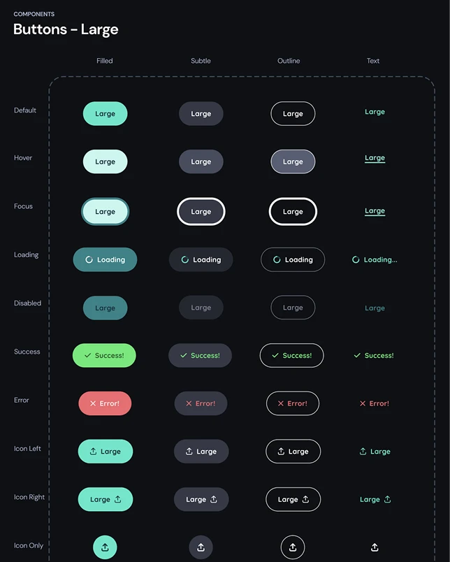
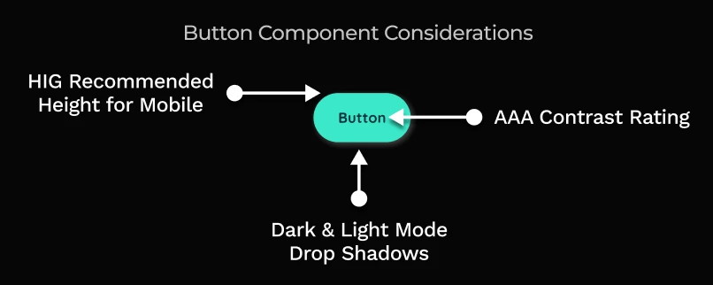
I prioritized token structure, component flexibility, usability, and accessibility considerations before visual polish. Even a button needed to account for interaction states, mobile target size, contrast, and presentation in light and dark interfaces.
Design parts that work together.
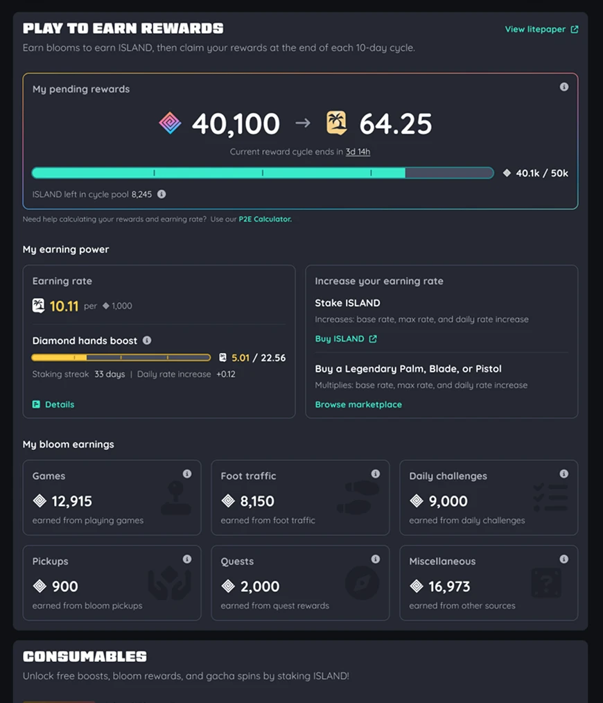
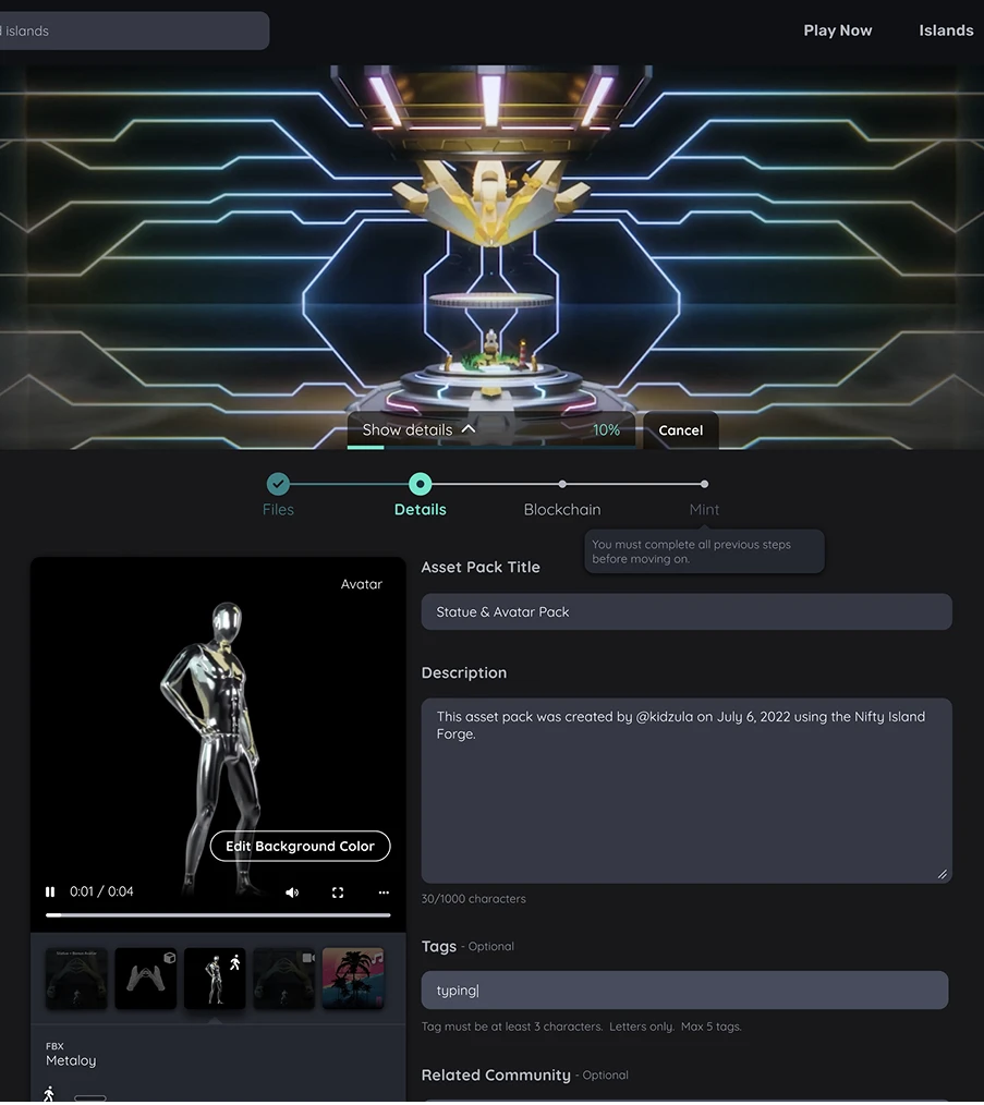
The roadmap included very different workflows: buying and selling assets, staking rewards, and importing user-created content. I designed components that could be combined and adapted across these flows, giving new features a consistent starting point.
Work with engineering throughout.
I developed the system alongside the frontend team, aligning the designs with implementation constraints as we went. That collaboration helped the system become something the team could use and maintain through ongoing releases.
03The solution
One design language across very different experiences.
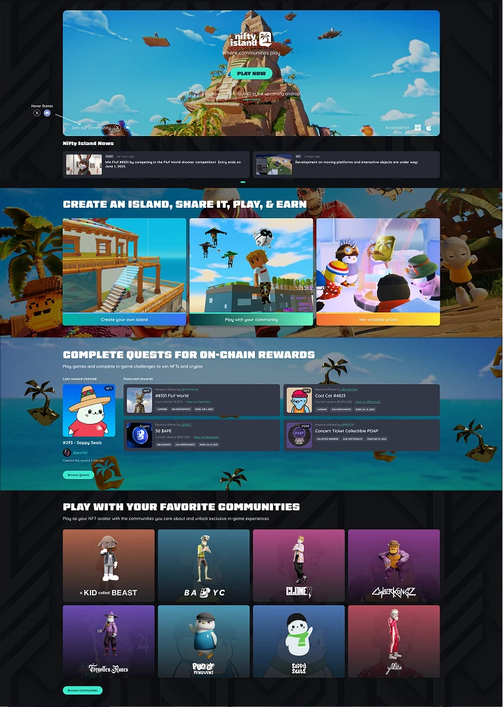
The system combined brand foundations, typography, component libraries, and templates. I maintained it while designing platform flows and providing direction for in-game UI, helping new work feel like part of the same product.
A foundation that stayed useful.
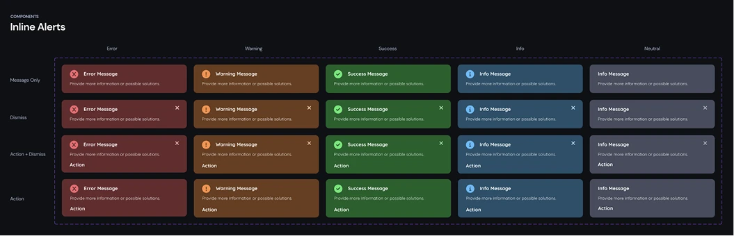
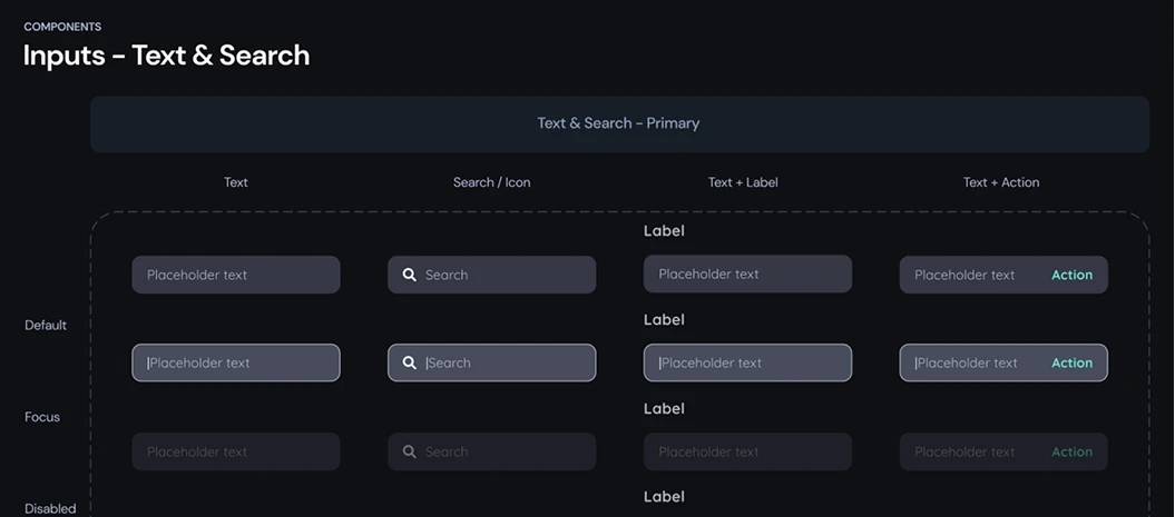
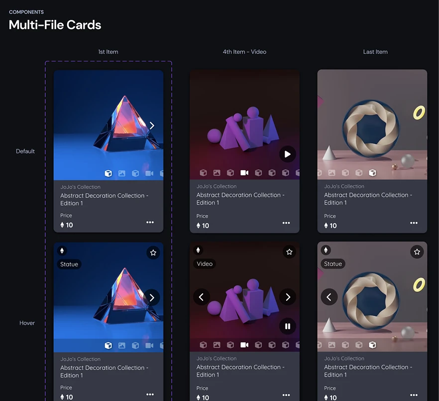
Buttons, alerts, inputs, and multi-file cards supported repeated interactions across features. These shared parts made it easier to extend the interface as the product grew, while keeping design decisions connected to the implementation.
04The outcome
A shared language the team could keep building on.
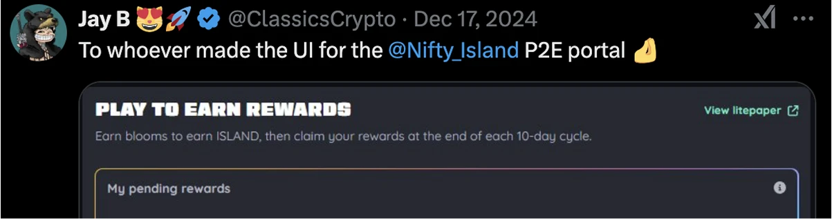
The design system became a common foundation for the engineering team as the platform expanded. The website and game UI shared a consistent visual language, and the team continued delivering complex features across the marketplace, rewards, and creator experiences.
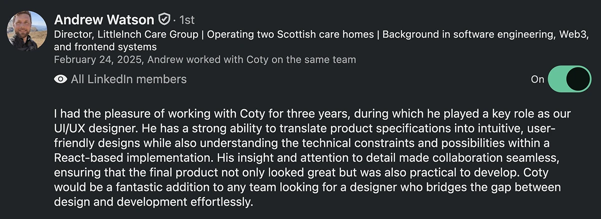
Feedback from engineering emphasized the practicality of the designs within a React implementation and the value of close collaboration. Player feedback also recognized the rewards interface.
A useful design system connects the product’s needs with the team’s ability to deliver.
The lasting value came from maintaining that connection: building reusable foundations, working with engineers early, and evolving the system through real product work.
Continue exploring